


In this article I will discuss the Top Web3 Multi-Channel Journey Mapping Tools that help teams understand user experiences across decentralized applications, wallets, communities, and digital channels.
We will explore their key journey-mapping features, Web3 relevance, multi-channel capabilities, analytics, collaboration options, practical use cases, and important limitations to help teams understand which tools fit different Web3 journey-mapping requirements.
Key Points & Top Web3 Multi-Channel Journey Mapping Tools
- UXPressia — Creates detailed customer journey maps across Web3 channels, touchpoints, personas, and user experiences.
- Smaply — Helps Web3 teams visualize journeys, stakeholder interactions, channels, pain points, and service processes.
- Miro — Provides collaborative journey mapping for Web3 teams, enabling flexible visual workflows and brainstorming sessions.
- TheyDo — Organizes Web3 customer journeys, opportunities, touchpoints, and product strategies within one structured workspace.
- Lucidchart — Enables Web3 teams to create clear journey diagrams, process flows, channel maps, and experience visualizations.
- Amplitude — Analyzes Web3 user behavior across digital channels to identify journey patterns, friction, and conversion opportunities.
- Mixpanel — Tracks Web3 product interactions across channels, helping teams understand engagement, retention, and user journeys.
- Heap — Automatically captures Web3 user interactions, revealing friction points and behavioral patterns across digital experiences.
- Custellence — Simplifies Web3 journey mapping with visual touchpoints, customer experiences, emotions, and service interactions.
- FigJam — Supports collaborative Web3 journey mapping through flexible boards, diagrams, workshops, notes, and team brainstorming.
10 Top Web3 Multi-Channel Journey Mapping Tools
1. UXPressia
UXPressia is of interest to Web3 teams wanting to get a handle on how users navigate the various touchpoints of decentralized products, from wallets and marketplaces to community spaces. The platform’s key features cover customer journey maps, personas, experience stages and pain points, as well as supporting CX data.
With its multi-channel capabilities, one can organize interactions for websites, apps, support lines and communities alike. The visual nature of the mapping makes it easy for teams to put journey insights on the table and collaborate on improvements.

For a Web3 marketplace, this could mean charting a course from initial discovery and wallet connection all the way to post-purchase support. It should be noted, however, that UXPressia is first and foremost an experience-design tool; those in need of deep product-event or on-chain analytics will have to look to other solutions.
UXPressia Pros & Cons
| Pros | Cons |
|---|---|
| Strong customer journey mapping capabilities | Advanced features may require paid plans |
| Supports personas and touchpoint visualization | Primarily focused on experience mapping |
| Useful for multi-channel Web3 journeys | Limited native blockchain analytics |
| Helps teams identify customer pain points | Can require complementary analytics tools |
2. Smaply
For Web3 teams with complex service and digital interactions to visualize, Smaply is a solid option. The software provides the means to build out journey maps with stakeholder perspectives, personas and relevant experience information.
Teams can use these maps to order their channels, be it mobile apps, websites or customer support. Its structured framework is conducive to working with stakeholders to pinpoint and address pain points.
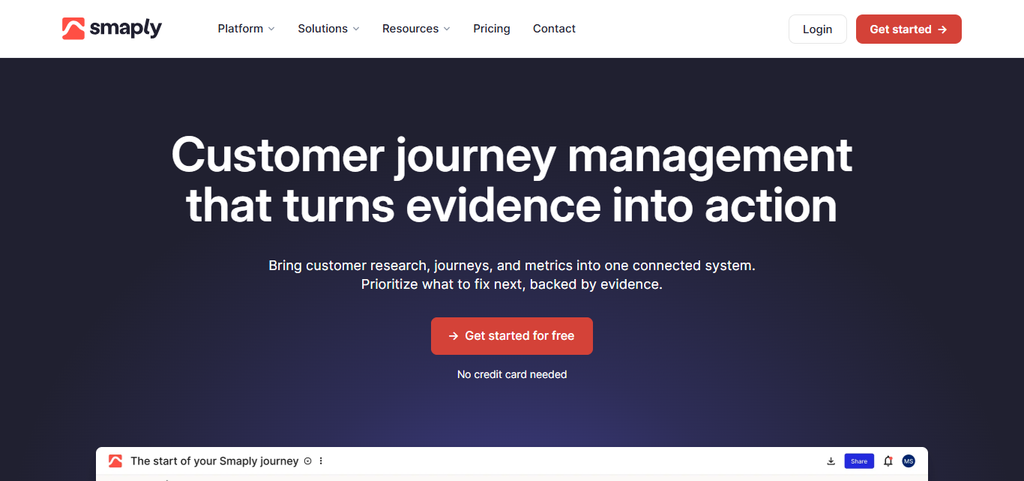
Consider a DeFi platform using Smaply to map the full arc of onboarding, from social discovery and wallet linking to retention and transactions. That said, Smaply is about experience mapping; if you are after specialized blockchain analytics to understand on-chain behavior, separate data tools are called for.
Smaply Pros & Cons
| Pros | Cons |
|---|---|
| Supports structured journey mapping | Advanced functionality may require paid access |
| Includes personas and touchpoint mapping | Not specifically designed for Web3 |
| Useful for stakeholder and service mapping | Limited native on-chain analytics |
| Supports collaborative experience planning | May require setup for complex journeys |
3. Miro
Miro offers the kind of flexible collaborative boards that Web3 teams require for plotting out decentralized user journeys and the like. One can put together a journey map with templates, sticky notes, diagrams and custom visuals. A typical Web3 path might run through dApps, Discord, social platforms and wallets.

Because of the real-time collaboration, distributed teams can come together to document user friction and review the work. A DAO, for instance, might map the process from when a member is discovered in the community to the point of proposal voting and ongoing engagement.
Keep in mind that while Miro is excellent for visual mapping, it does not offer the quantitative measurement of Web3 behavioral analytics that some may want.
Miro Pros & Cons
| Pros | Cons |
|---|---|
| Highly flexible visual workspace | Large boards can become difficult to manage |
| Strong real-time collaboration | Not specialized for Web3 analytics |
| Offers journey mapping templates | Requires manual journey organization |
| Useful for distributed Web3 teams | Advanced features may require paid plans |
4. TheyDo
TheyDo has relevance for product teams in the Web3 space who wish to tie their customer journeys to product discovery and planning. The tool allows for the structured organization of CX info, including opportunities, stages and touchpoints.
Teams can link up what they see in terms of customer problems with planned product fixes in a shared workspace. Take a Web3 wallet team: they could use TheyDo to map everything from onboarding and security interactions to transaction activity
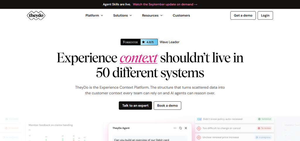
Making sure any friction is connected to a product initiative. However, for detailed analytics on blockchain transactions, a dedicated infrastructure is generally necessary in addition to the journey-mapping functions here.
TheyDo Pros & Cons
| Pros | Cons |
|---|---|
| Connects journeys with product strategy | Can have a learning curve for new users |
| Supports structured journey management | Not a dedicated blockchain analytics platform |
| Helps organize opportunities and touchpoints | Advanced capabilities may require paid access |
| Useful for product and UX teams | Less focused on raw behavioral analytics |
5. Lucidchart
Web3 organizations can turn to Lucidchart to put pen to paper on the operational processes and user journeys between their decentralized products and the services that back them. Through flowcharts and diagramming, teams can represent the interplay of dApps, support, social communities and websites in a connected way.

This collaborative approach is useful for reviewing workflows and flagging any gaps. A crypto exchange might employ it to document the entire sequence of account creation, identity checks, trading and withdrawals. It is worth bearing in mind that Lucidchart is a general purpose diagramming platform, not a solution built specifically for Web3 journey analytics.
Lucidchart Pros & Cons
| Pros | Cons |
|---|---|
| Strong diagramming and visualization capabilities | Primarily a general diagramming platform |
| Supports journey and process mapping | Limited native Web3-specific functionality |
| Useful for complex workflow documentation | Large diagrams can become complex |
| Supports team collaboration | Advanced features may require paid plans |
6. Amplitude
Web3 relevance: For Web3 teams, Amplitude is the go-to for gauging user behavior in digital product journeys as opposed to simply looking at a visual map. Key journey-mapping features: The platform’s analytics can be put to work for event tracking, funnels, behavioral and retention analysis, as well as user segmentation.
Multi-channel capability: With the right event data in place, one can analyze how users interact with websites, apps and other digital experiences. Analytics/collaboration: Product teams have the means to use this behavioral data to zero in on drop-offs, engagement and the more critical stages of a journey.
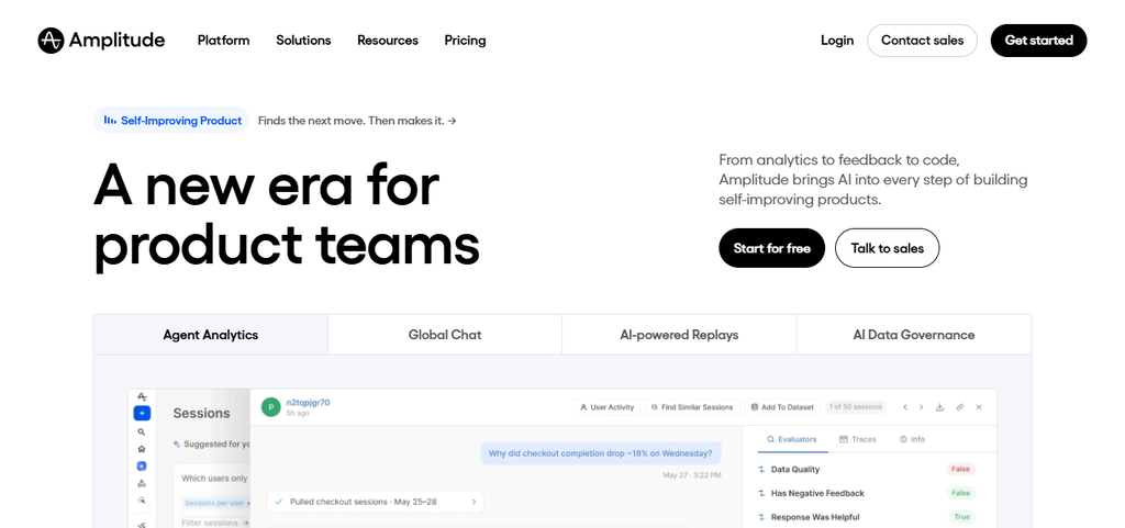
Specific Web3 use case: Consider a Web3 app that needs to see where a user gives up on wallet onboarding or what prompts them to come back after an initial interaction. Important limitation: It is not first and foremost a visual mapping tool and requires good product instrumentation; Web3 operations will likely have to look to blockchain-specific sources for some of their data.
Amplitude Pros & Cons
| Pros | Cons |
|---|---|
| Strong product and behavioral analytics | Requires proper event instrumentation |
| Supports funnels and retention analysis | Not primarily a visual journey-mapping tool |
| Useful for identifying user drop-offs | Blockchain-specific data may need integration |
| Supports user segmentation | Advanced analytics can require setup expertise |
7. Mixpanel
Web3 relevance: Mixpanel allows Web3 product teams to get a handle on user behavior by way of measurable events and interactions. Key journey-mapping features: You will find its analytics cover the essentials: event analysis, funnels, reporting on behavior and user segmentation.
Multi-channel capability: Provided events are set up correctly, teams can follow user activity across mobile and web. Analytics/collaboration: Growth and product groups can call on this data to make sense of retention, conversion and any drop-off patterns.
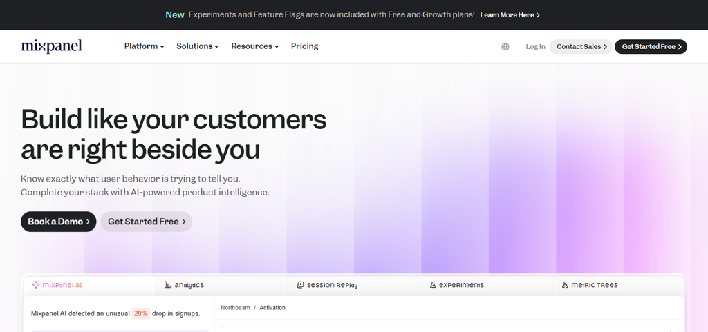
Specific Web3 use case: A dApp or wallet might use it to trace the route from account setup and connection through to repeat usage and feature adoption. Important limitation: Mixpanel is about instrumented product behavior; it will not automatically pick up on every kind of blockchain interaction, meaning some on-chain data integration may be necessary.
Mixpanel Pros & Cons
| Pros | Cons |
|---|---|
| Strong event-based product analytics | Requires accurate event tracking |
| Supports funnels and retention analysis | Not designed specifically for Web3 |
| Useful for understanding user behavior | Native blockchain analysis is limited |
| Provides detailed user segmentation | Complex implementations may require technical resources |
8. Heap
Web3 relevance: Where Web3 teams want to see friction and gain a detailed view of the digital experience, Heap has value. Key journey-mapping features: Its method is to capture and make sense of the data from user interactions, behavioral patterns and funnels.
Multi-channel capability: Teams can review what is happening on various digital interfaces and sites, subject to the environment and implementation. Analytics/collaboration: Rather than making assumptions, a team can do a behavioral analysis to find out where users are being put off or walk away from key steps.
Specific Web3 use case: An application could use Heap to look into how people engage with transaction interfaces, onboarding or wallet connection. Important limitation: Since Heap is oriented toward digital experience analytics and not blockchain journey mapping per se, complementary sources are needed for on-chain activity.
Heap Pros & Cons
| Pros | Cons |
|---|---|
| Captures detailed digital user interactions | Mainly focused on digital product analytics |
| Helps identify behavioral friction | Not a dedicated Web3 journey-mapping tool |
| Supports funnel and journey analysis | Blockchain activity may require additional data sources |
| Useful for discovering unexpected behaviors | Can require analysis expertise for large datasets |
9. Custellence
Web3 relevance: This is a way for Web3 teams to put a visual structure on customer experiences that span a number of service touchpoints. Key journey-mapping features: Custellence handles the visualization of the customer journey, pain points, channels and the like.
Multi-channel capability: Interactions can be mapped whether they are in a community, support service, wallet or on a Web3 site. Analytics/collaboration: Having a visual of the journey is helpful for getting stakeholders on the same page about problems and improvements.
Specific Web3 use case: A marketplace could chart the whole process from discovery and asset browsing to the purchase, confirmation and any post-transaction support. Important limitation: It is mainly for visualization; if the requirement is for deeper behavioral or blockchain analytics, another tool is in order.
Custellence Pros & Cons
| Pros | Cons |
|---|---|
| Focused on customer journey visualization | Limited advanced behavioral analytics |
| Supports touchpoints and channel mapping | Not specifically built for Web3 |
| Useful for identifying experience pain points | May need external analytics integrations |
| Provides structured journey documentation | Advanced requirements can need additional tools |
10. FigJam
Web3 relevance: FigJam provides the collaborative space Web3 teams need to put together and talk through customer journeys in decentralized products. Key journey-mapping features: From diagrams and templates to sticky notes and workshops, it covers the bases for journey-mapping.
Multi-channel capability: One can visually link up the various touchpoints, be it a Discord community, social network, dApp or support channel. Analytics/collaboration: The whiteboard format is conducive to distributed teams putting down ideas, reviewing a user’s path and spotting friction.

Specific Web3 use case: A startup might map out everything from the point of social discovery to the first transaction and subsequent community involvement. Important limitation: Do not mistake it for an analytics platform; FigJam is for design and collaboration, not for running the numbers on blockchain or user behavior.
FigJam Pros & Cons
| Pros | Cons |
|---|---|
| Flexible collaborative whiteboarding environment | Not a dedicated analytics platform |
| Supports journey maps and visual workshops | Limited native behavioral analytics |
| Useful for distributed Web3 teams | Complex boards can become crowded |
| Supports brainstorming and journey visualization | Blockchain-specific insights require external tools |
Conclusion
To sum up, there is no shortage of tools like UXPressia, Miro, TheyDo, Amplitude, Mixpanel or FigJam that can be used to visualize and refine how users interact with dApps, support channels and websites. Each brings its own method to the table when it comes to mapping and analytics.
In the end, the choice of platform will come down to a number of factors: the depth of analytics required, the complexity of the channels, what resources are at hand, and the degree of collaboration and integration a team requires.
FAQ
They visualize user experiences across dApps, wallets, communities, websites, and support channels.
They help identify user touchpoints, friction, drop-offs, and opportunities across decentralized experiences.
Popular options include UXPressia, Smaply, Miro, TheyDo, Lucidchart, and FigJam.
Some provide analytics, while others primarily visualize journeys and require external analytics platforms.
Yes, teams can map wallet connections, transactions, onboarding, verification, and related touchpoints.